
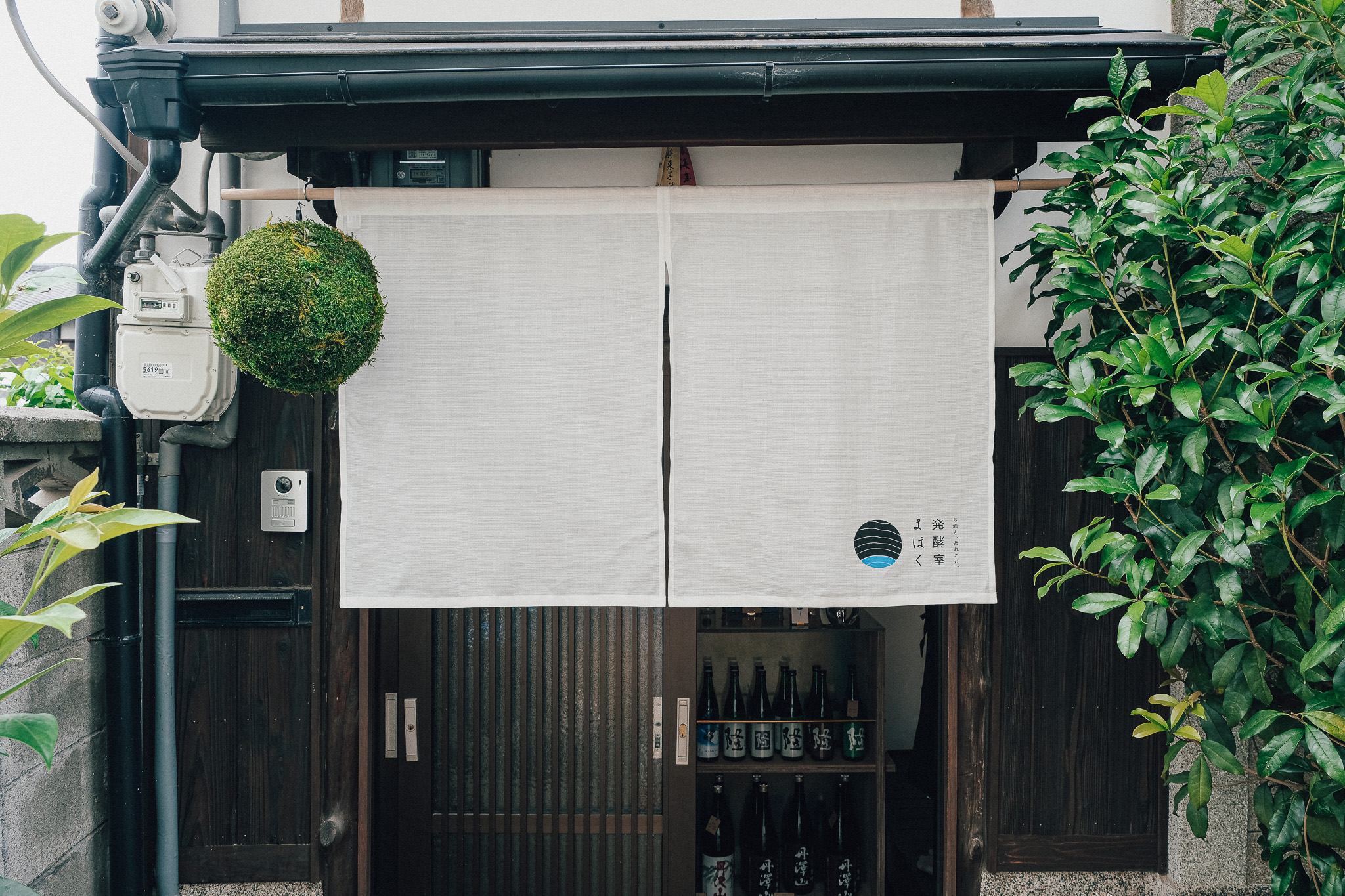
Hakkoshitsu Yohaku (2023)
SIBO designed the branding and graphic design for this sake shop, which focuses on sake and fermented foods, located in Sakyo-ku, Kyoto, a 1-minute walk from Mototanaka Station on the Eizan Railway. This is SIBO's first project in which the concept of the store was implemented in every corner of the actual space by designing not only the space but also the branding in an integrated process.
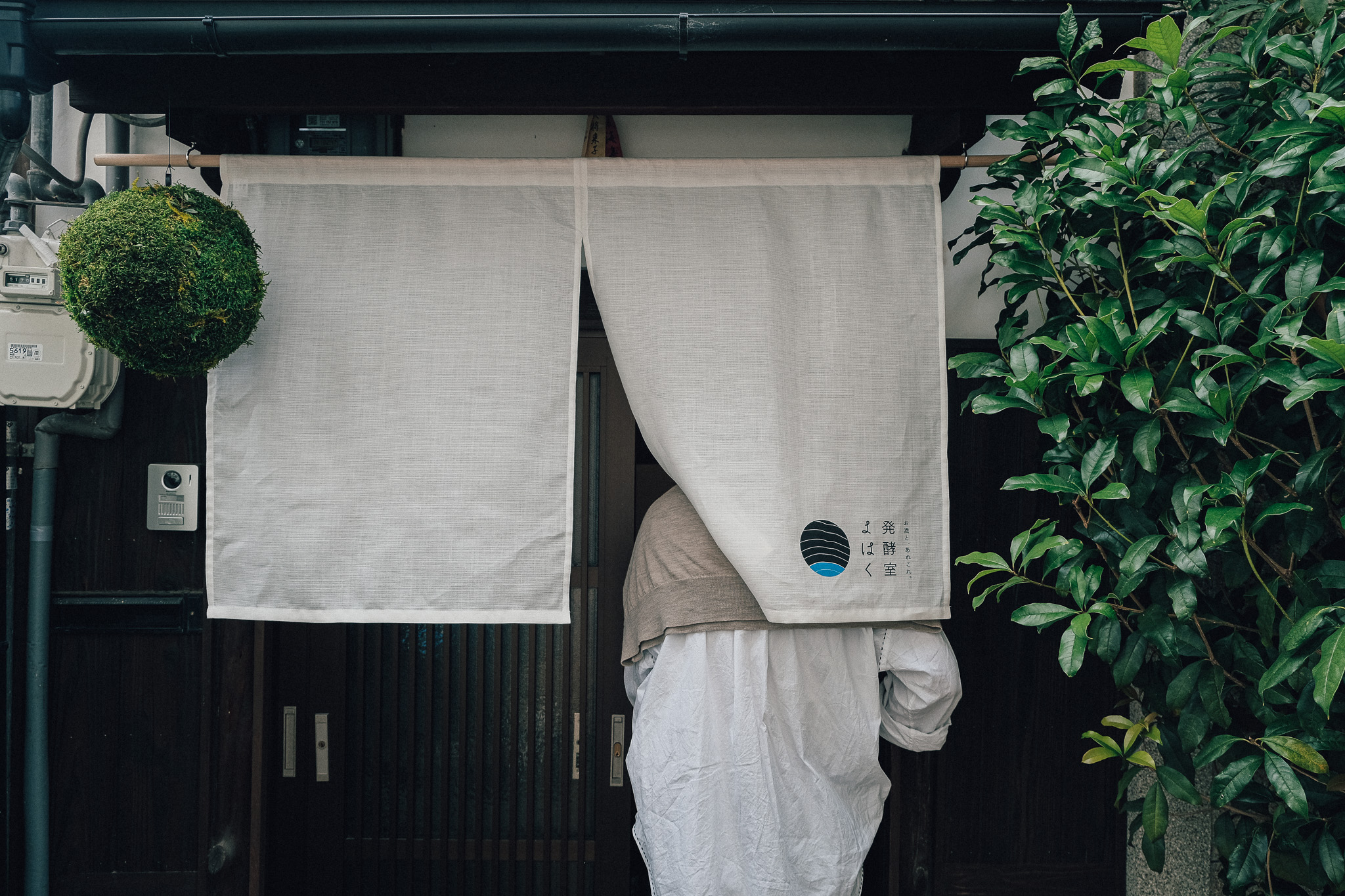
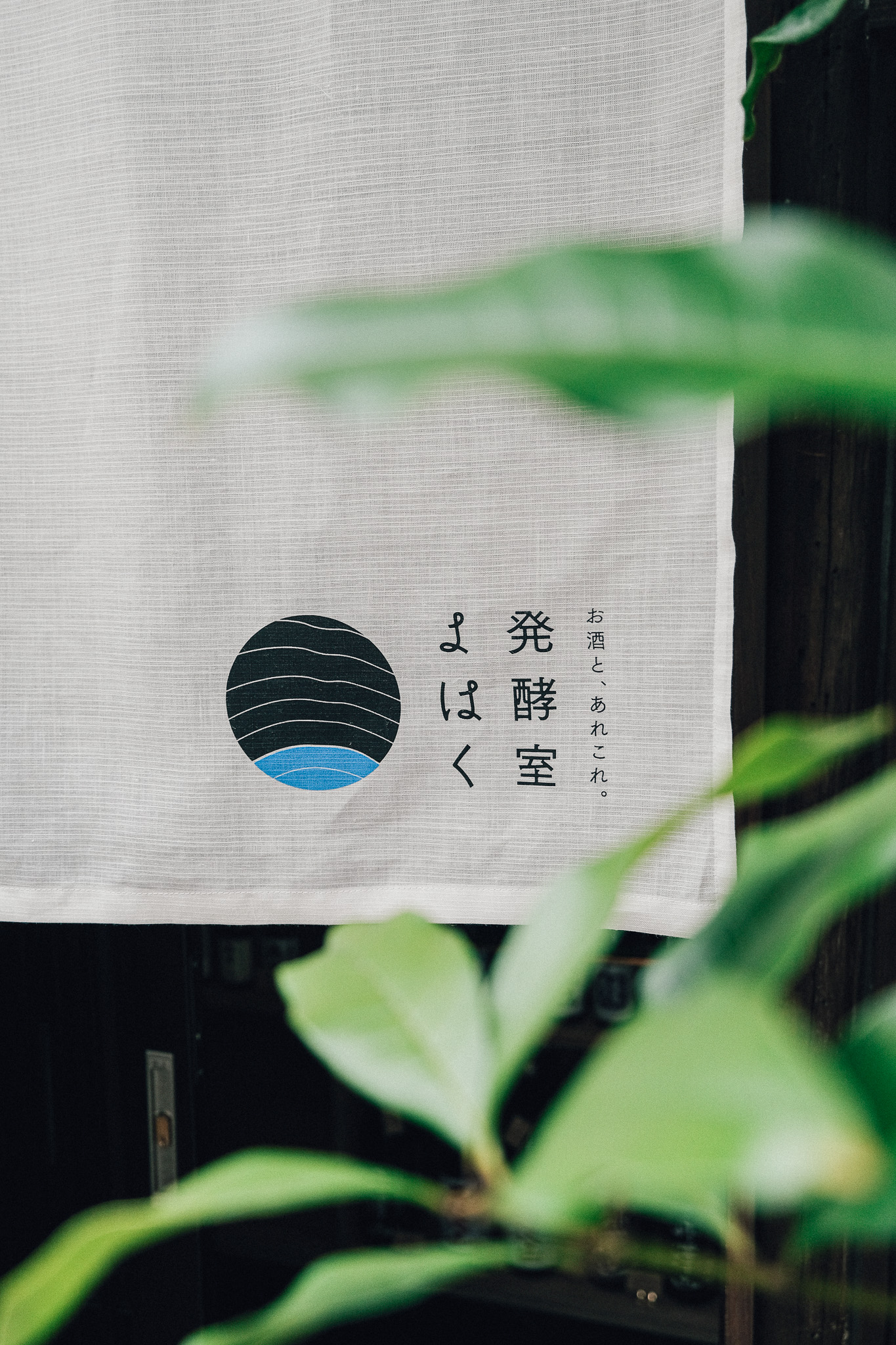
○Logo, store card, signboard, goodwill
The logo design is a cross between a record and a stratum (or annual ring).
It takes an endless amount of time to create a thin layer of less than 1cm of strata or annual rings. Between the layers, there is far more "blank space" than the information that can be obtained from them.
The labeled portion of a colored record represents the mantle in a stratum, the pith in a tree. This part is the "core" of the store, and it is also the energy of "rock" and "fermentation" that Mr. Mano, the owner of the store, loves.
The concentric circles designed in this logo are extended and developed into other tools. The image of the circle spreading out looks like a ripple that propagates to people as this store is a base for the dissemination of Japanese sake and fermented foods.
Normally, printed materials tend to rely on simple printing techniques such as cutting sheets and inkjet printing, but we used rheographs and silk screens to create graphic tools with a "mono-feeling" in-house, taking into account the visual effect created by the overlapping of the materials.
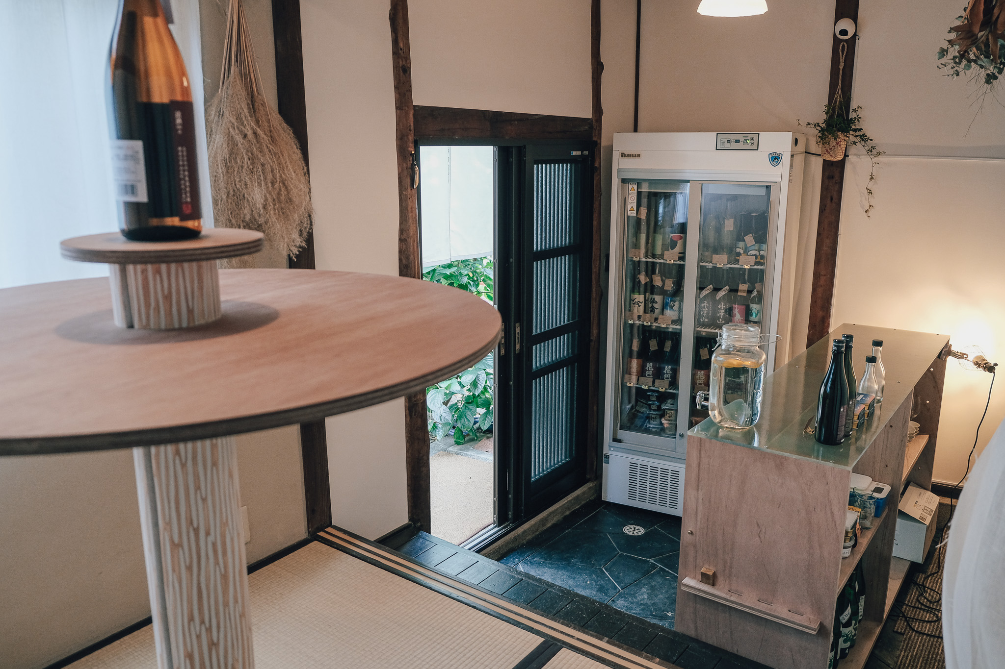
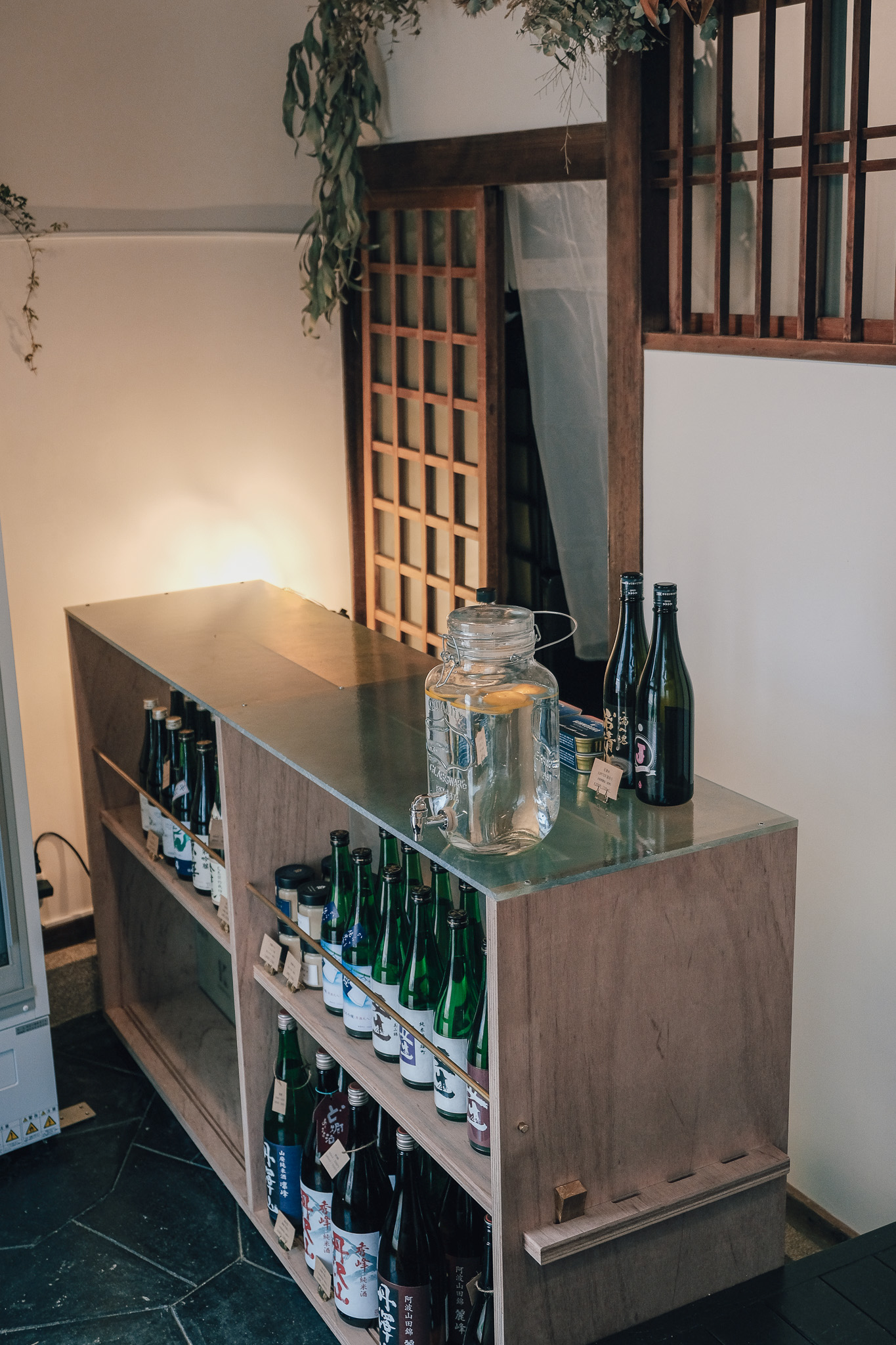
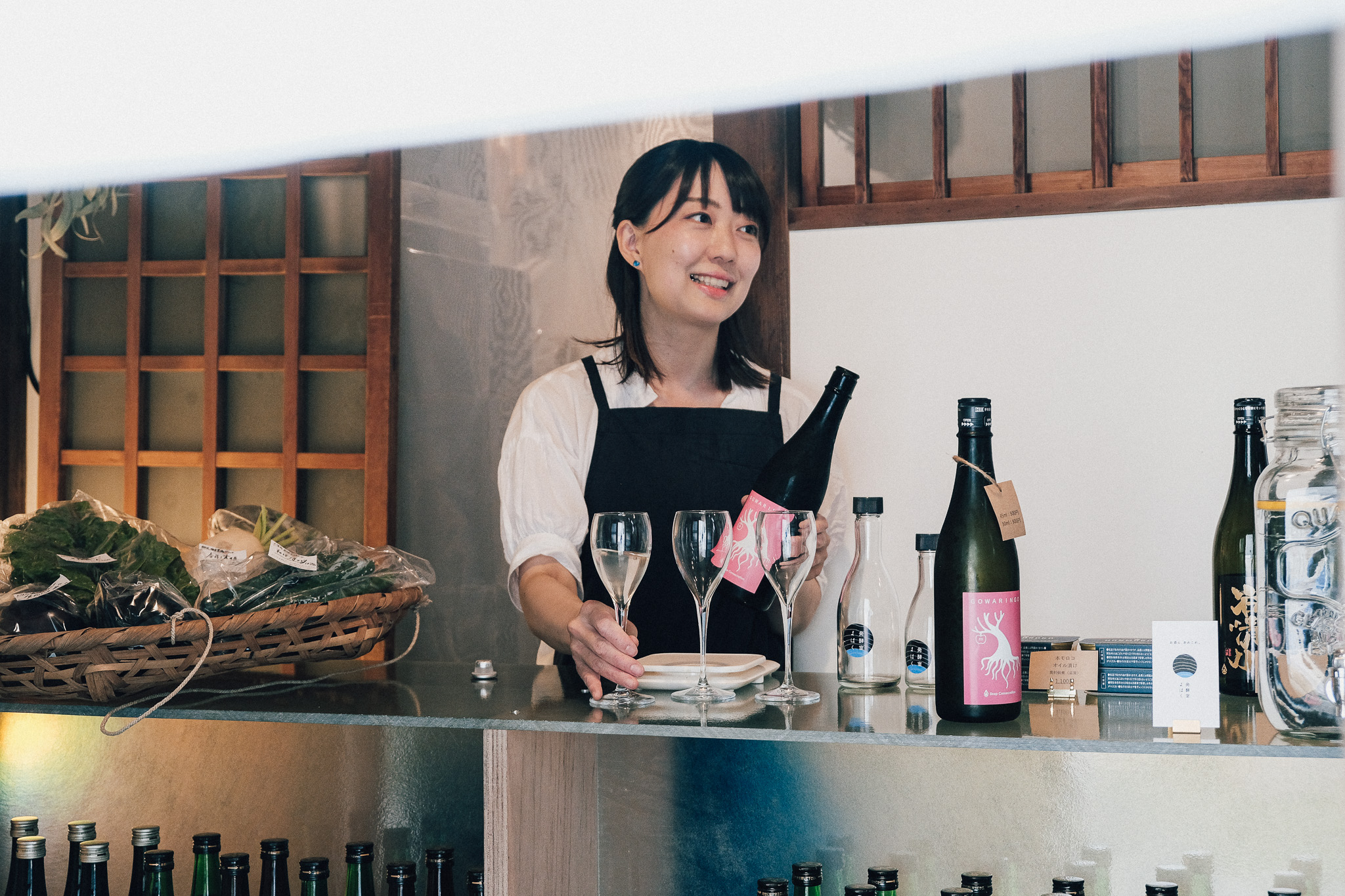
○Counter
This is a counter and sake display shelf for serving customers and standing in the entrance space.
The Japanese design is reminiscent of sake and fermented food, which have taken root in Japan since ancient times, and the details and materials used were chosen so that the narrow space of approximately 8m2 would not feel cramped.
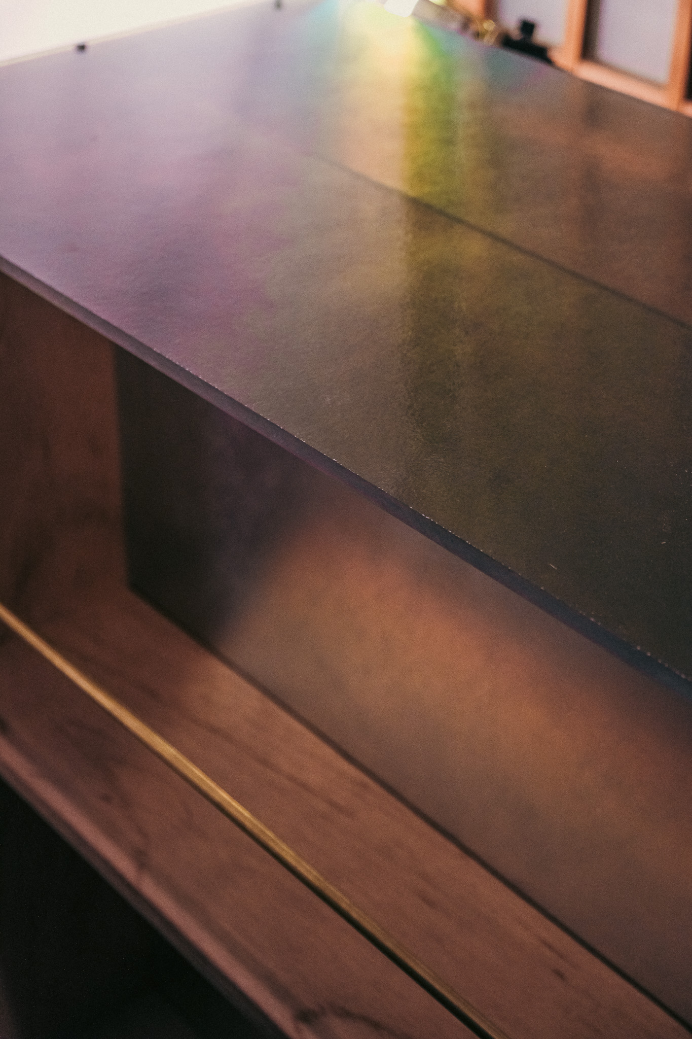
The materials used include a curtain panel in the center of the counter and 5mm and 10mm FRP boards for the top panel. FRP is a material that allows light/images to penetrate and has high strength, and its arrangement on both vertical and horizontal surfaces creates a sense of spatial expansion even over the counter.
The traditional Japanese concept of "nuki" and "wedge" is used throughout. The second level of the counter is assembled in such a way as to penetrate the three vertical boards (nuki), which unite and strengthen the whole without the use of screws or nails. At both ends and in the center, a block of brass is inserted to prevent the vertical boards from shifting horizontally (wedge). By following the concept of the stakes and wedges, a structure that can be easily assembled and disassembled has been realized.
The production was done in collaboration with Plamo Furniture in Osaka. The details of the penetration and wedge holes were determined by taking into consideration the machining conditions of the ShopBot owned by the customer. The machine was given only the role of supplementing work that was difficult to do by hand, and the edge machining and finishing were done by hand. This division of labor allows for a delicate, Japanese-style detailing, rather than a mediocre design due to mechanization.
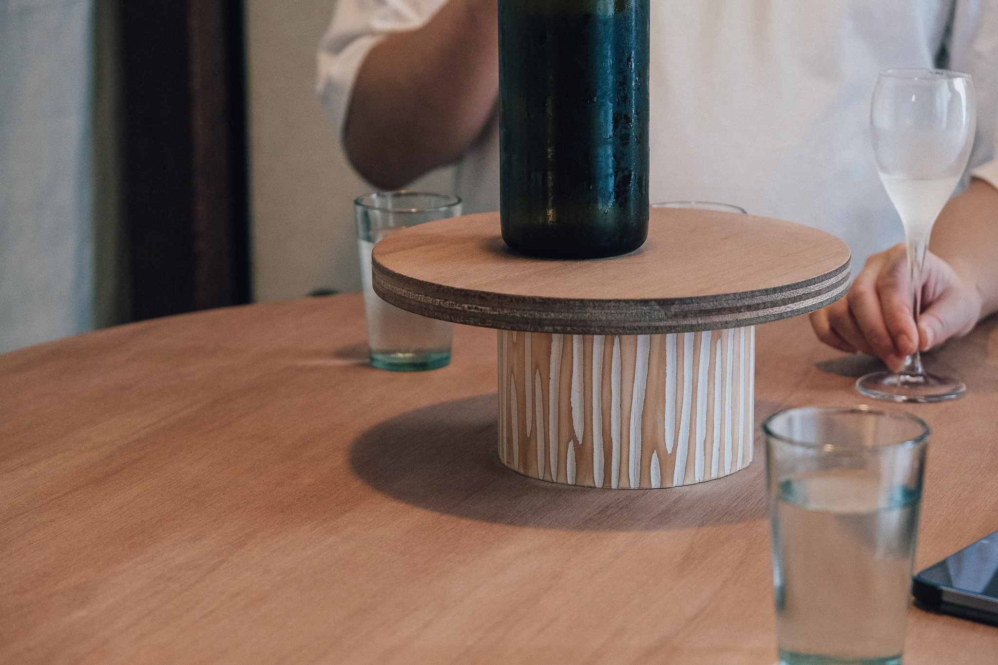
○Round table
This is a table and showcase for enjoying Kaku-uchi in a standing drinking style in the 2 tatami-mat room above the ceremonial platform.
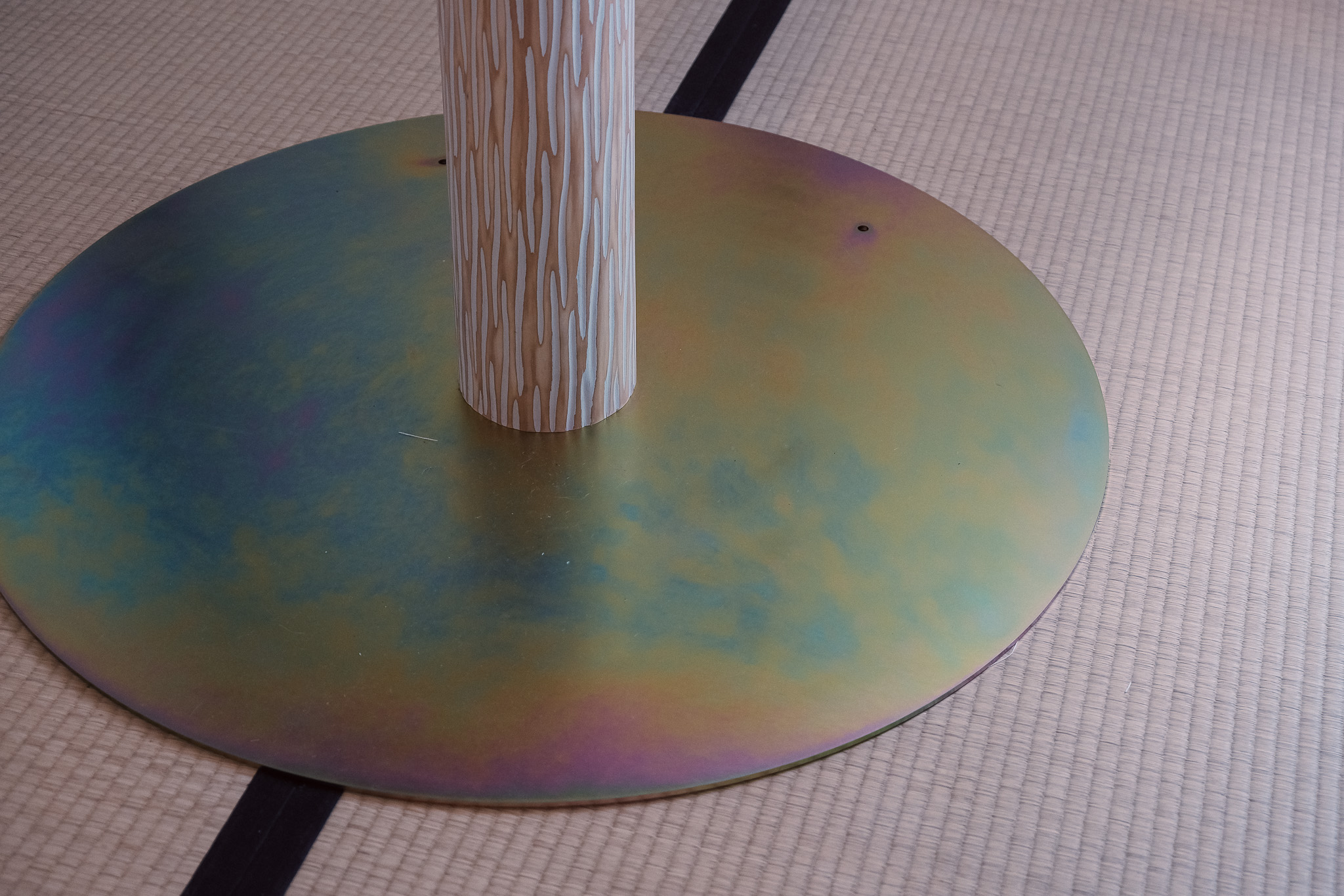
The material used for the table's legs is Kitayama shibori logs, the starting point of SIBO's activities. 120-150mm diameter logs have a solid and stable presence, like the daikoku-bashira (main pillar) in Japanese traditional houses, and the painted and machined surface finish expresses a product quality that logs originally used for floor posts do not have. The painted surface and the scraped finish express a product quality that logs, which are originally used for floor posts, do not have.
The bottom plate and the joint surface between the top plate and the log are made of Φ900 and Φ600 metal plates. These metal plates have a special chromate finish that changes their appearance depending on the direction in which they are viewed and the direction in which light hits them. This special chromate finish resonates with the aforementioned FRP counter, and these two materials allow the space to change with the morning, noon, and night, and with the four seasons.
As a detail, the ends of the logs have been rolled to form a simple structure, and disks are inserted to connect the logs to the foundation. The joints that enable the joining of different materials to the aperture log, a material that has not yet been used for anything other than building materials, were developed by SIBO on its own. The table was created by taking advantage of the material characteristics of each component, such as the mass of the metal plate, the ease of development into a joint, and the rigidity of the log.

「発酵室よはく」(2023)
京都市左京区、叡山電鉄「元田中駅」から徒歩1分の場所にある日本酒と発酵食に焦点を当てた酒屋です。SIBOでは店のブランディング及びグラフィックデザインをはじめ、約8m2の玄関先空間に酒屋と角打ち空間を設計しました。空間のみならず、ブランディングから一貫して請け負うことで、店のコンセプトを実空間の隅々にまで実装したSIBO初めてのプロジェクトです。
○ロゴ・ショップカード・立て看板・暖簾
ロゴは、レコードと地層(あるいは年輪)を掛け合わせたデザインです。
地層や年輪はその1cmにも満たない薄い層をつくるのに果てしない時間を要します。その一層一層の間には、そこから得られる情報より遥かに多くの「余白」が内包されています。
着色されたレコードのラベル部分は、地層におけるマントル、年輪(木)における髄を表します。その部分こそが最も強度と熱を孕んだ「核」となる部分で、店主の真野さんが愛する「ロック」や「発酵」のエネルギーにも通ずるコンセプトとなっています。
このロゴで設計した同心円の形を拡張し、その他のツールに展開しています。円が広がっていくようなイメージは、このお店が日本酒や発酵食品の発信基地として人々に伝播していく波紋のようにも見えます。
通常カッティングシートやインクジェットプリントなど簡便な印刷技術に頼ってしまいがちな印刷物ですが、リソグラフやシルクスクリーンを用い、素材との重なりによって生み出される視覚効果までを考慮した「モノ感」のあるグラフィックツールを自社で制作していきました。
○カウンター
玄関空間で、接客及び立ち飲みができるカウンター兼日本酒のディスプレイ棚です。
日本古来から固有のものとして根付いてきた日本酒・発酵食から想起される日本的なデザイン、約8m2と狭い空間の中でその狭さを感じさせないディテール・素材の選択を思考しました。
素材としては、カウンター中央に位置する幕板と、天板に5mmと10mmのFRP板を採用しました。FRPという素材は、光/像を透過させ、かつ強度の高い特徴を持ち、これらが垂直面・水平面に配置されることでカウンター越しにも空間の広がりを感じる構成としています。
ディテールとしては、日本古来の貫と楔という概念を踏襲し各所に採用しています。カウンターの2段目の板は、垂直に並ぶ3枚の板を貫くように組まれており(貫)これによってビス・釘を使わずとも全体が一体化し強度を持ちます。両端部及び中央には垂直の板が水平方向にずれないように真鍮の塊を突き刺しています(楔)。貫・楔の考え方を踏襲することで、簡単に組立・解体が可能な納まりが実現しました。
製作は大阪のプラモ家具さんと協働しました。所有されるShopBotの加工条件などを加味し、貫・楔穴のディテールなどを決定しました。あくまで機械には手加工では難しい作業を補う役割のみを与え、端部の加工・仕上げなどは手作業で製作しています。この役割分担により、機械化による凡庸なデザインではなく、繊細で日本的なディテールを実現しています。
○ラウンドテーブル
式台を上がった2畳の畳間で、立ち飲み形式で角打ちが楽しめるためのテーブル兼見せ台です。
素材としては、我々SIBOの活動原点である「北山絞り丸太」をテーブルの一本足に使用しています。Φ120~150の丸太の一本足は、日本民家にある大黒柱のようなどっしりと安定感のあるものとして存在するとともに、表面に施した塗装+削り出し仕上げは、本来床柱に使われる丸太には持ち合わせないプロダクト性を表現しています。
また底板、及び天板と丸太の接合面には、Φ900とΦ600の金属板を使用しています。この金属板は特殊なクロメート加工を施しており、見る方向・光の当たる方向によって表情を変える効果を持っています。この特殊クロメート加工は前述のカウンターのFRPと共鳴し、この二つの素材によって空間は朝昼夜、四季に寄り添い移ろいます。
ディテールとしては、シンプルな構造を成立させるため丸太の端部に座繰り加工を施し、土台との接続に使用する円盤を挿入しています。絞り丸太という未だ建材以外での使われ方がない素材に対して異素材との接合を可能にしたジョイントはSIBOが独自に開発したものです。金属板の質量とジョイントへの展開のしやすさ、丸太の剛性の高さなど、各部材が持つ素材特性を活かしたテーブルを制作しました

Client: Haruka Mano (Hakkoushitsu Yohaku)
Grafic Design: Ryota Mizusako
Shop Design: Shin Tomita, Toki Sakurai
Project Management: Ryota Mizusako, Shin Tomita
Producution: Toki Sakurai, Shin Tomita, Ryota Mizusako, Li Chengjie
Production Collaborators: Pramo 3×6
Grafic Design: Ryota Mizusako
Shop Design: Shin Tomita, Toki Sakurai
Project Management: Ryota Mizusako, Shin Tomita
Producution: Toki Sakurai, Shin Tomita, Ryota Mizusako, Li Chengjie
Production Collaborators: Pramo 3×6