

TENKARA GELATO (2023)
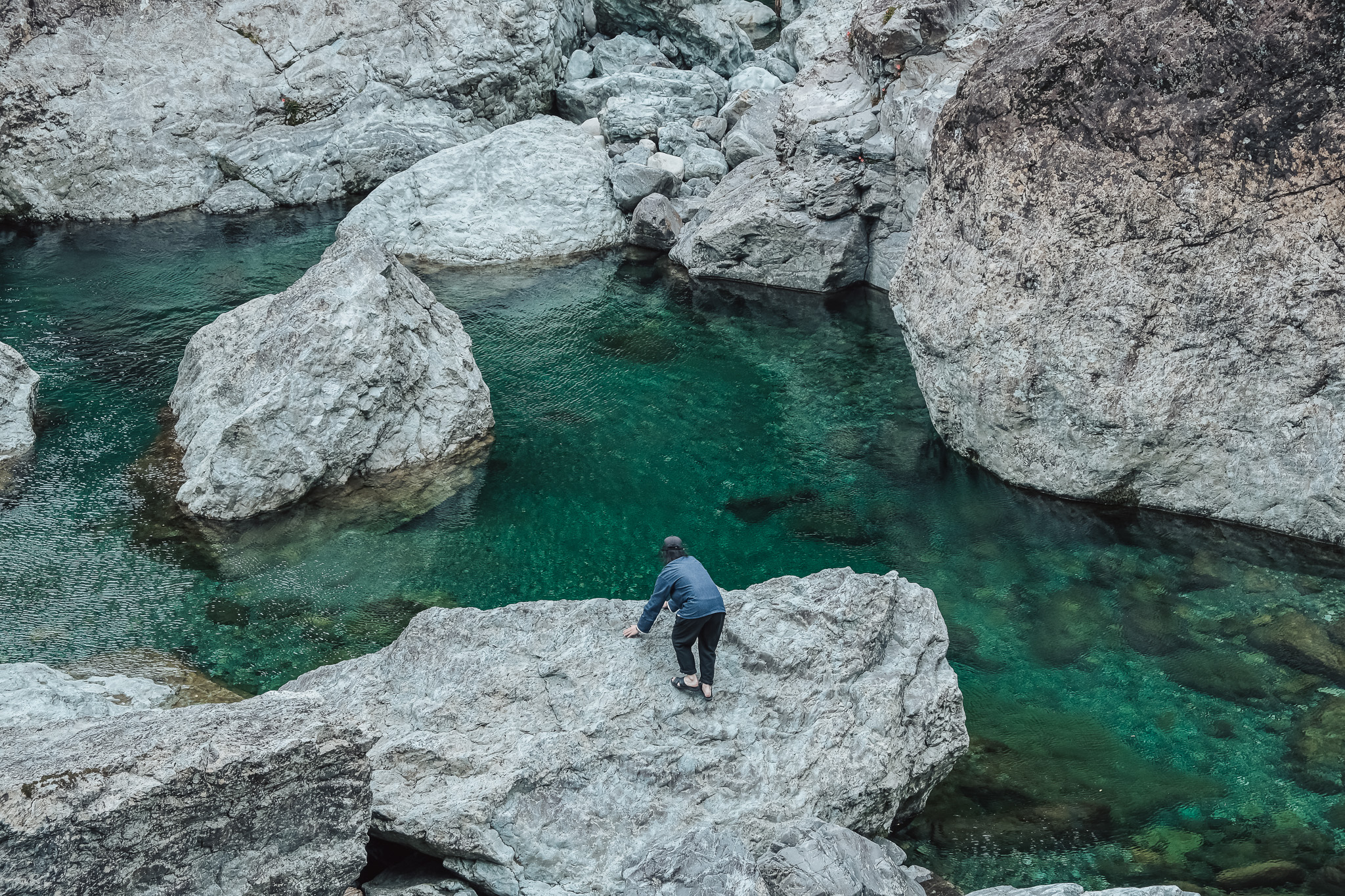
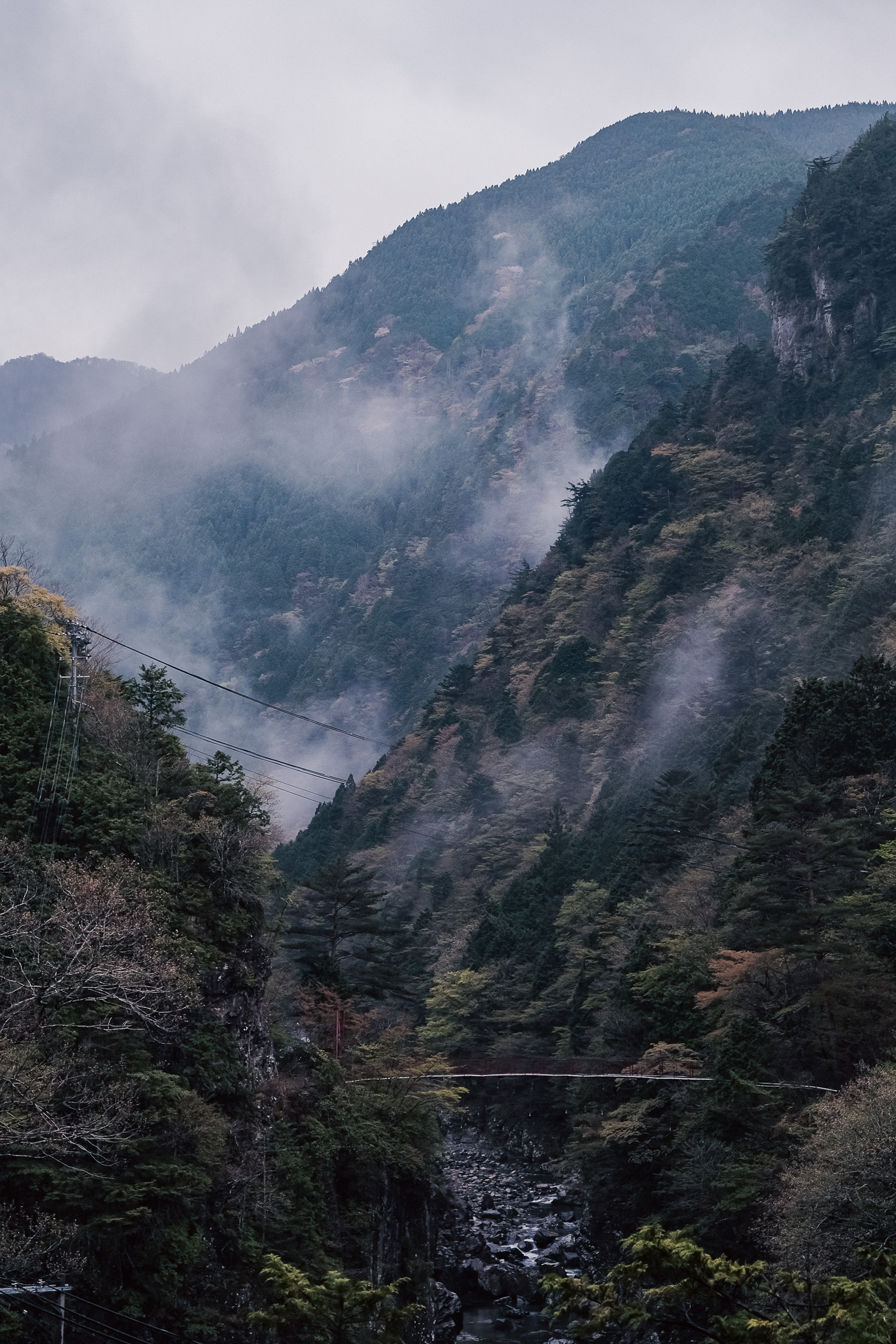
An hour and a half drive south of Nara City, up a mountain, lies the village of Tenkawa, which is called the Land of Heaven.
The village, one-fourth of whose area is designated as Yoshino-Kumano National Park, is the birthplace of Shugendo, a mountain asceticism founded 1,300 years ago by En no Gyoja, and is still visited by many ascetic practitioners. Although the population is decreasing and the village is small, with only about 1,100 inhabitants, the area is visited by 640,000 campers a year for its beautiful river and cool climate.
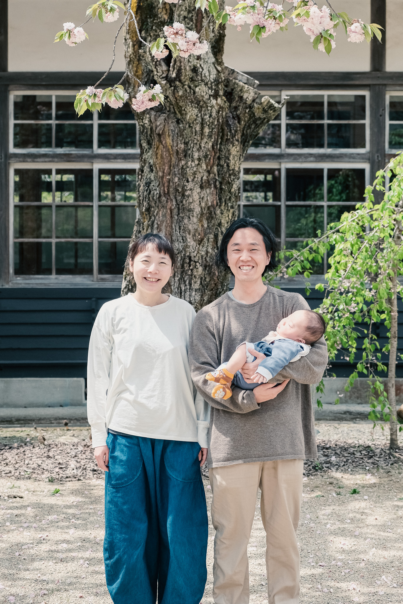
Ayako Hatanaka, who runs a Japanese restaurant in Kanazawa, and her husband, French chef Toshiharu Sunayama, moved to Tenkawa Village and opened a gelato store called TENKARA GELATO. Their gelato, made from local ingredients nurtured in the beautiful nature and organic as much as possible, tastes natural and surprisingly rich in flavor. While practicing agriculture themselves, they will continue to introduce their gelato, which is filled with the beauty of Amagawa, with an eye to creating employment in the region through food.
奈良市内から車で南に1時間半、山を登った先に、天の国と呼ばれる村・天川村はあります。
面積の4分の1が吉野熊野国立公園に指定されるこの村は、1300年前に役行者によって開かれた修験道発祥の地として、今もなお多くの修験者が修行に訪れる場所です。
人口は減少の一途で1100人ほどの小さな村ですが、美しい川と涼しい気候を求めて年間64万人のキャンプ客が訪れるエリアでもあります。
そんな天川村に、金沢で和食店を経営する畠中亜弥子さんとフレンチシェフ砂山利治さん夫妻が移住し、TENKARA GELATOというジェラート店をオープンさせました。
美しい自然に育まれた地域食材を用い、可能な限りオーガニックな原料にこだわったジェラートは、自然な味わいながら驚くほど風味豊か。
彼らは自らも農業を実践しながら、地域に食で雇用を生んでいくことまでを見据えながら、天川の美しさを詰め込んだこのジェラートを発信していきます。
We at SIBO took on the entire process of branding, graphic design, interior design, and fixture production for TENKARA GELATO.
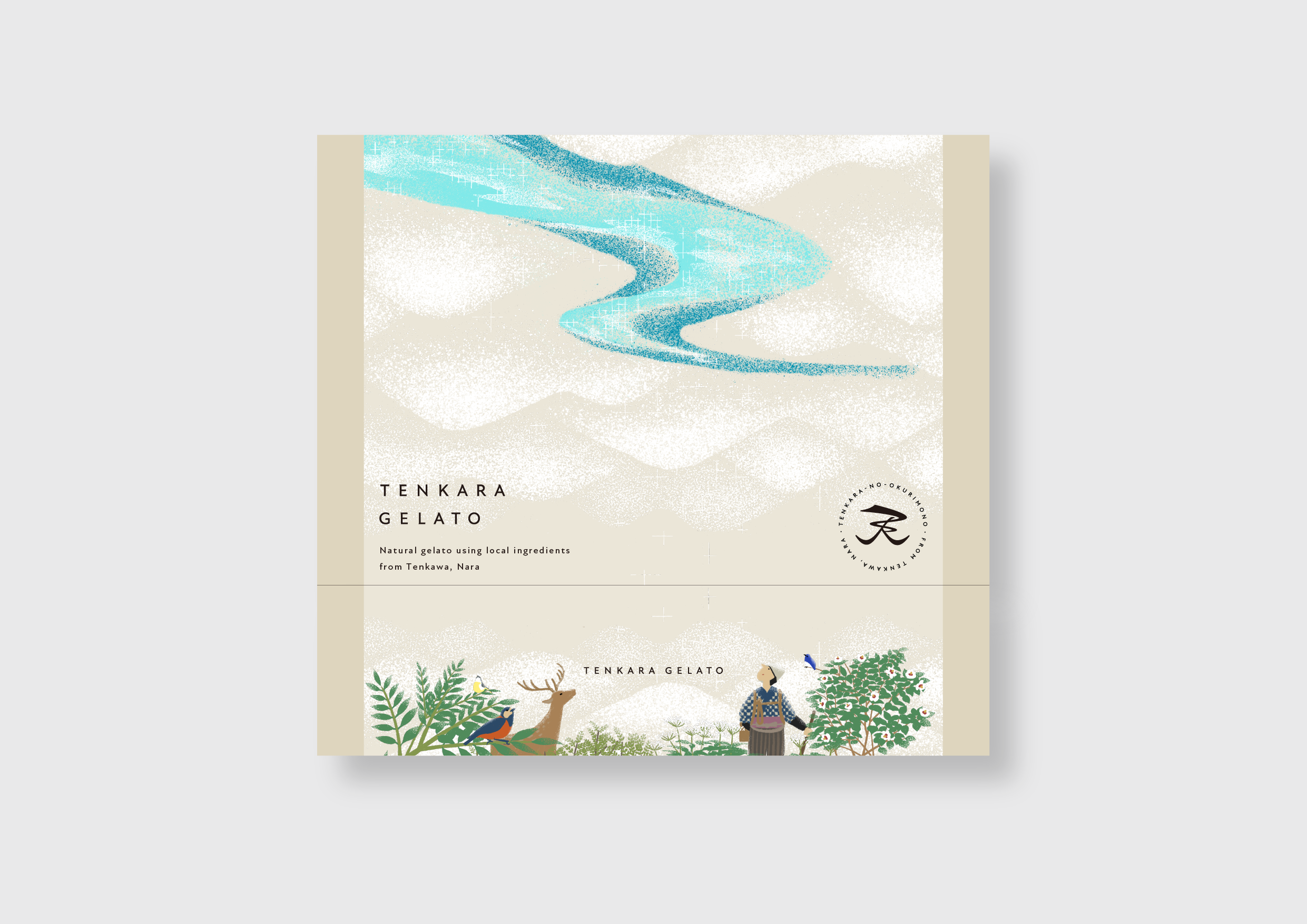
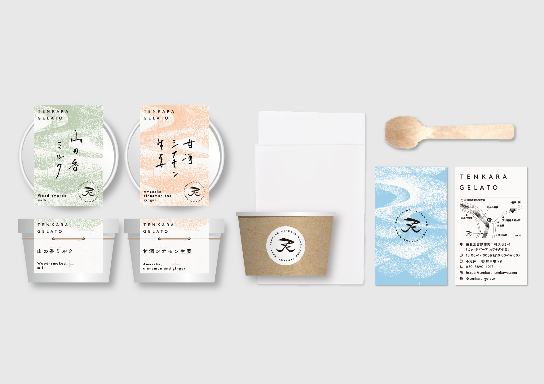
The branding and graphic design "TENKARA" is a concept that will be the crown of all their future projects. We designed a symbol mark that can be used commonly in the series of products commonly referred to as the "Heavenly Gift" series. The symbol mark is based on the character for "heaven. This character can be rotated 180 degrees to reveal different motifs. It becomes a single river flowing between mountains. By turning the logo upside down, the blessings of the Milky Way will fall from the heavens, and this is the meaning of the logo. The key visuals that will be used on packaging and other items will be based on the same concept, with the rivers flowing through the mountains being turned upside down to resemble the Milky Way. This illustration is also extended as a pattern graphic to the large curtain that hangs over the space.
私たちSIBOは、TENKARA GELATOのブランディングからグラフィックデザイン、内装設計、什器製作までを一貫して引き受けました。
◯ ブランディング及びグラフィックデザイン
「TENKARA」は彼らが今後つくっていくあらゆる事業の冠になる概念でもあります。通称「天からのおくりものシリーズ」で共通で使用できるシンボルマークを設計しています。
シンボルマークは、「天」の文字をモチーフにしています。この文字は、180度回転することで異なるモチーフを浮かび上がらせます。山々の間から流れる一筋の川になるのです。上下ひっくり返すことによって天川の恵が天から降り落ちてくる、そんな意味をこめたロゴになっています。
パッケージなどで展開していくキービジュアルも同じ考え方で、山々を流れる川を天地ひっくり返すことで天の川に見立てたデザインとなっています。
このイラストレーションは空間にかかる大暖簾にもパターングラフィックとして拡張しています。
Space Design
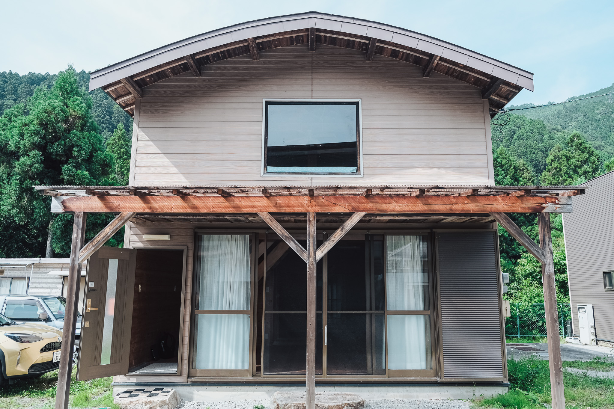
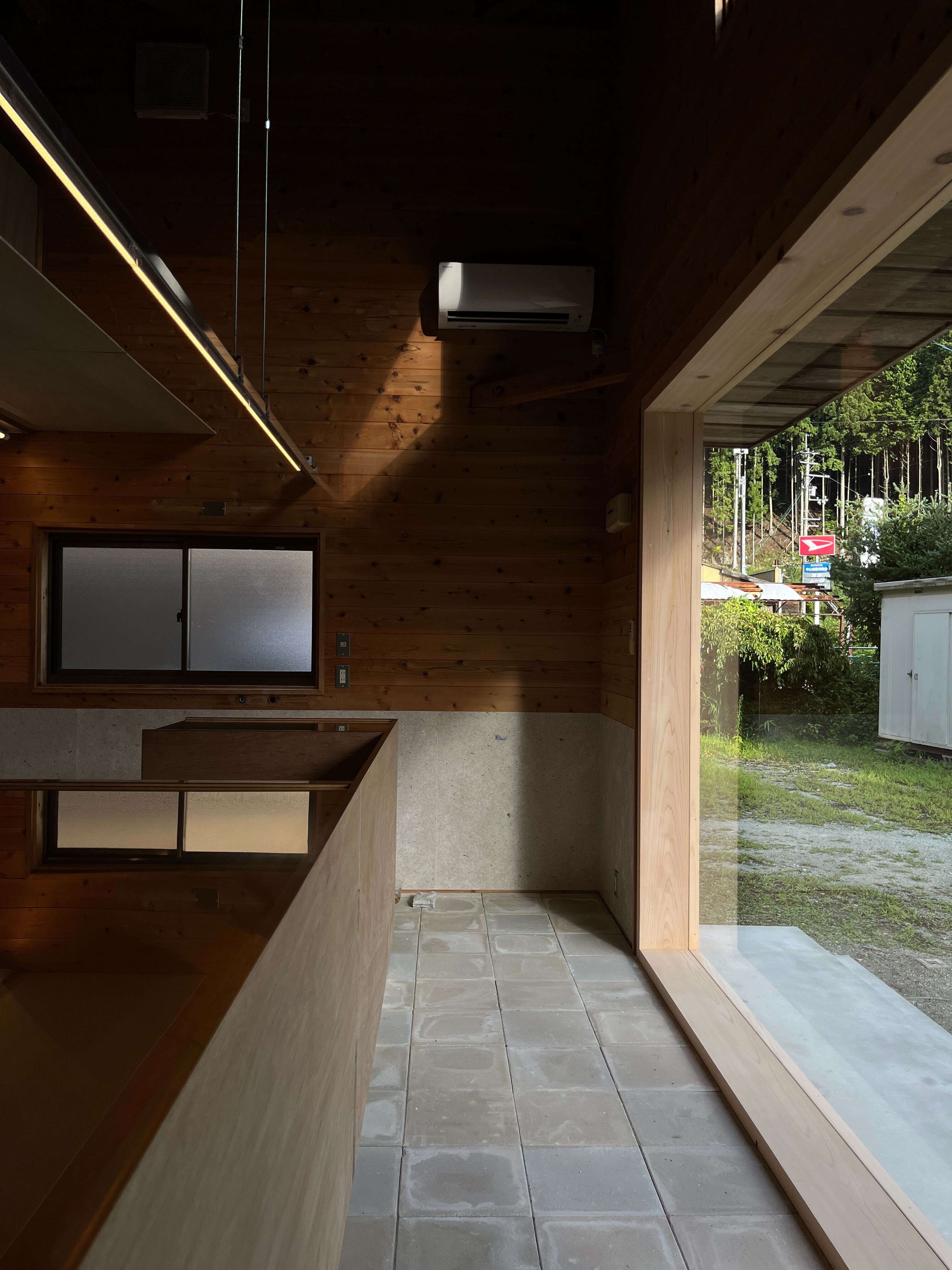
The building to be renovated is a two-story wooden cottage-style structure with a total floor space of about 75m2. It is surrounded by a parking lot used by people playing in the river behind the house, and there is another building of the same style. Behind the entrance, there is a forest and the murmur of the river can be heard.
Two uses were desired: a production facility for making gelato and a store for selling it in stores during the summer on-season. The main business is to distribute the gelato to stores, and to sell it in stores only during the summer season.
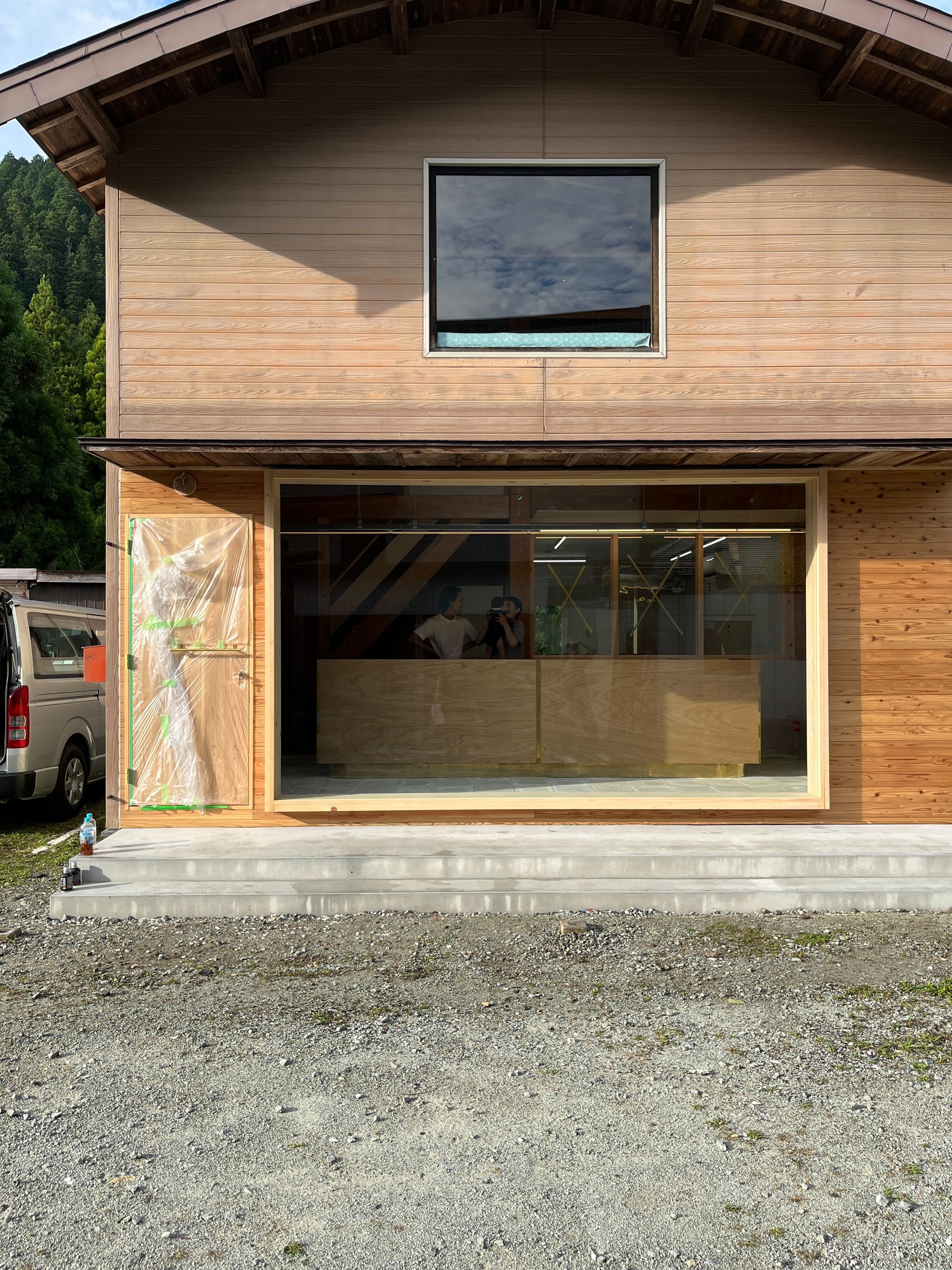
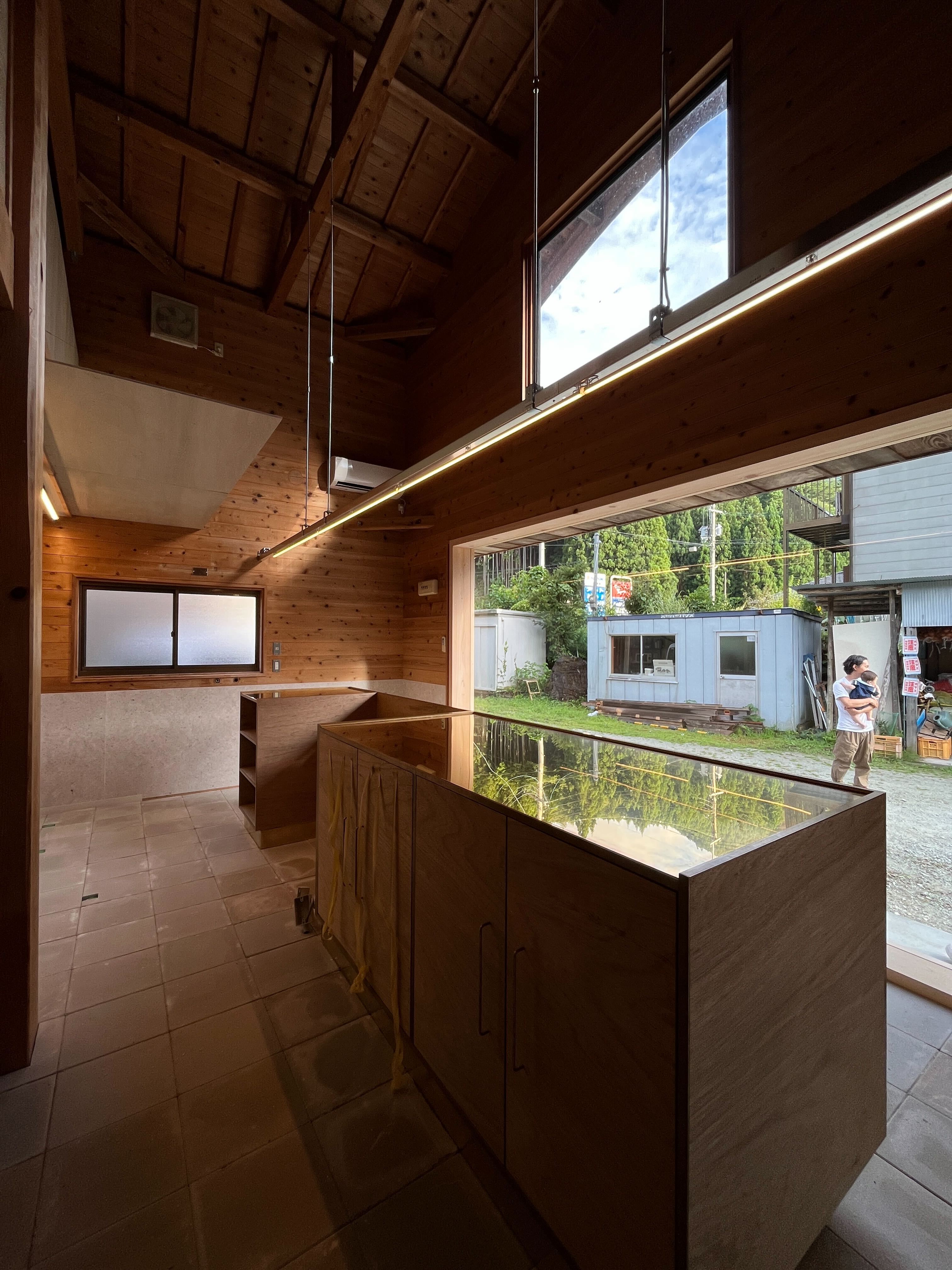
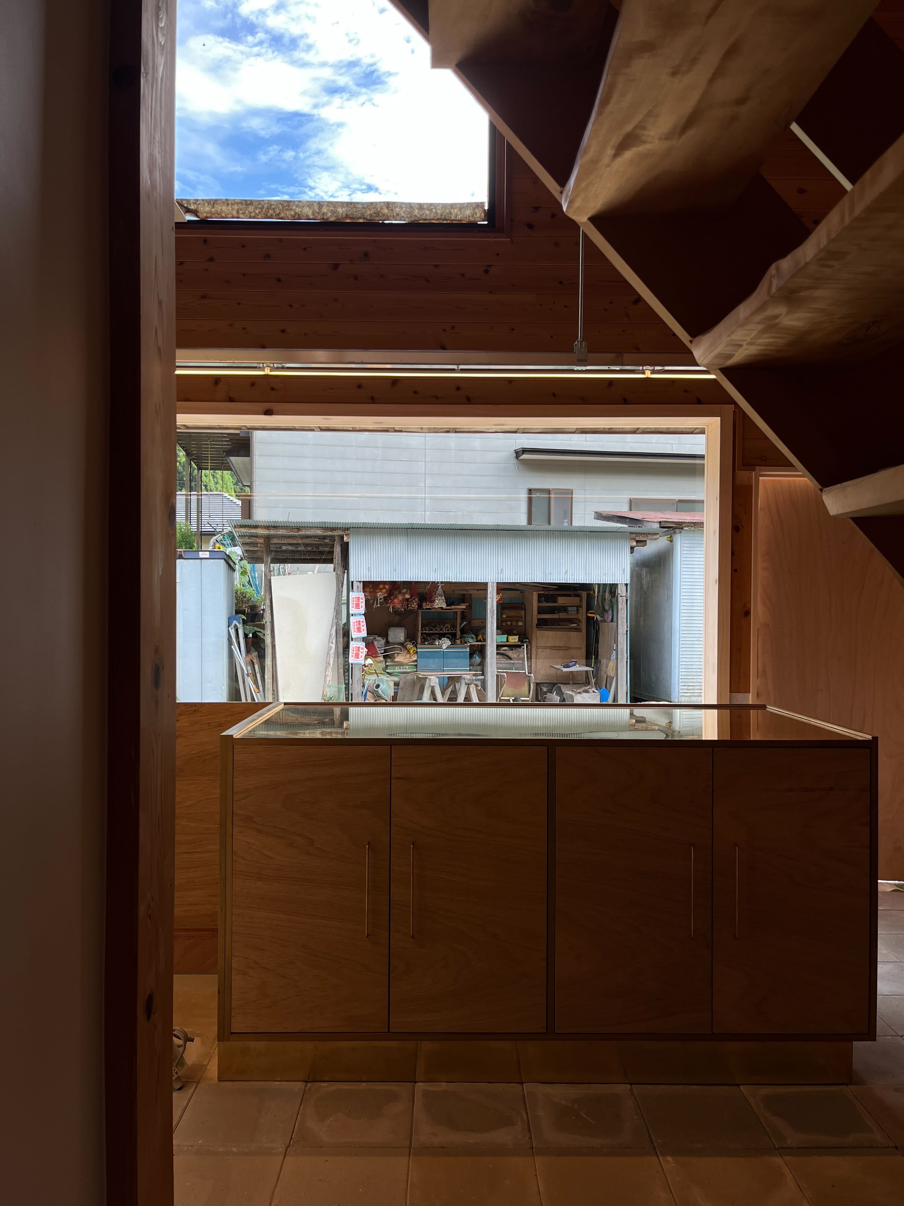
The building is characterized by two large, symmetrical openings, one large and one small, in the upper and lower portions of the elevation, and a two-story atrium space upon entering the front left entrance. We worked on a design that would highlight these two features to the maximum extent possible.
Two concepts were used to define the overall design this time: "symmetry" and "too big for its own good.
The design of the space is based on two concepts: "symmetry" and "something too big".
◯空間デザイン
改修の対象建物は、コテージ形式の延床75m2ほどの二階建て木造。周囲は、裏の川で遊ぶ人々が利用する駐車場があり、また同じ形式の建物がもう一棟建っている。玄関の裏側には、森が広がっており、川のせせらぎが聞こえる。
用途としては、ジェラート製造のための製作所と、夏のオンシーズン店頭で販売するためのショップの2つを望まれた。基本は各店舗に卸す形が主となり、シーズンのみ店頭販売も行う営業形態を想定されている。
建物の特徴として、立面に左右対称の大きな開口部が上下に大小二つあること、正面左の玄関を入ると二層吹き抜けの空間があることが挙げられる。この二つの特徴を最大限際立たせる設計に取り組んだ。
今回全体のデザインを決める定義として、「左右対称」「大きすぎるもの」の2つのコンセプトを用いている。
・大きな窓のショーケース
・内と外をつなぐ広場
・大きなカウンター
・大きな暖簾
The building to be renovated is a two-story wooden cottage-style structure with a total floor space of about 75m2. It is surrounded by a parking lot used by people playing in the river behind the house, and there is another building of the same style. Behind the entrance, there is a forest and the murmur of the river can be heard.
Two uses were desired: a production facility for making gelato and a store for selling it in stores during the summer on-season. The main business is to distribute the gelato to stores, and to sell it in stores only during the summer season.
The building is characterized by two large, symmetrical openings, one large and one small, in the upper and lower portions of the elevation, and a two-story atrium space upon entering the front left entrance. We worked on a design that would highlight these two features to the maximum extent possible.
Two concepts were used to define the overall design this time: "symmetry" and "too big for its own good.
The design of the space is based on two concepts: "symmetry" and "something too big".
◯空間デザイン
改修の対象建物は、コテージ形式の延床75m2ほどの二階建て木造。周囲は、裏の川で遊ぶ人々が利用する駐車場があり、また同じ形式の建物がもう一棟建っている。玄関の裏側には、森が広がっており、川のせせらぎが聞こえる。
用途としては、ジェラート製造のための製作所と、夏のオンシーズン店頭で販売するためのショップの2つを望まれた。基本は各店舗に卸す形が主となり、シーズンのみ店頭販売も行う営業形態を想定されている。
建物の特徴として、立面に左右対称の大きな開口部が上下に大小二つあること、正面左の玄関を入ると二層吹き抜けの空間があることが挙げられる。この二つの特徴を最大限際立たせる設計に取り組んだ。
今回全体のデザインを決める定義として、「左右対称」「大きすぎるもの」の2つのコンセプトを用いている。
・大きな窓のショーケース
・内と外をつなぐ広場
・大きなカウンター
・大きな暖簾

Counter Design
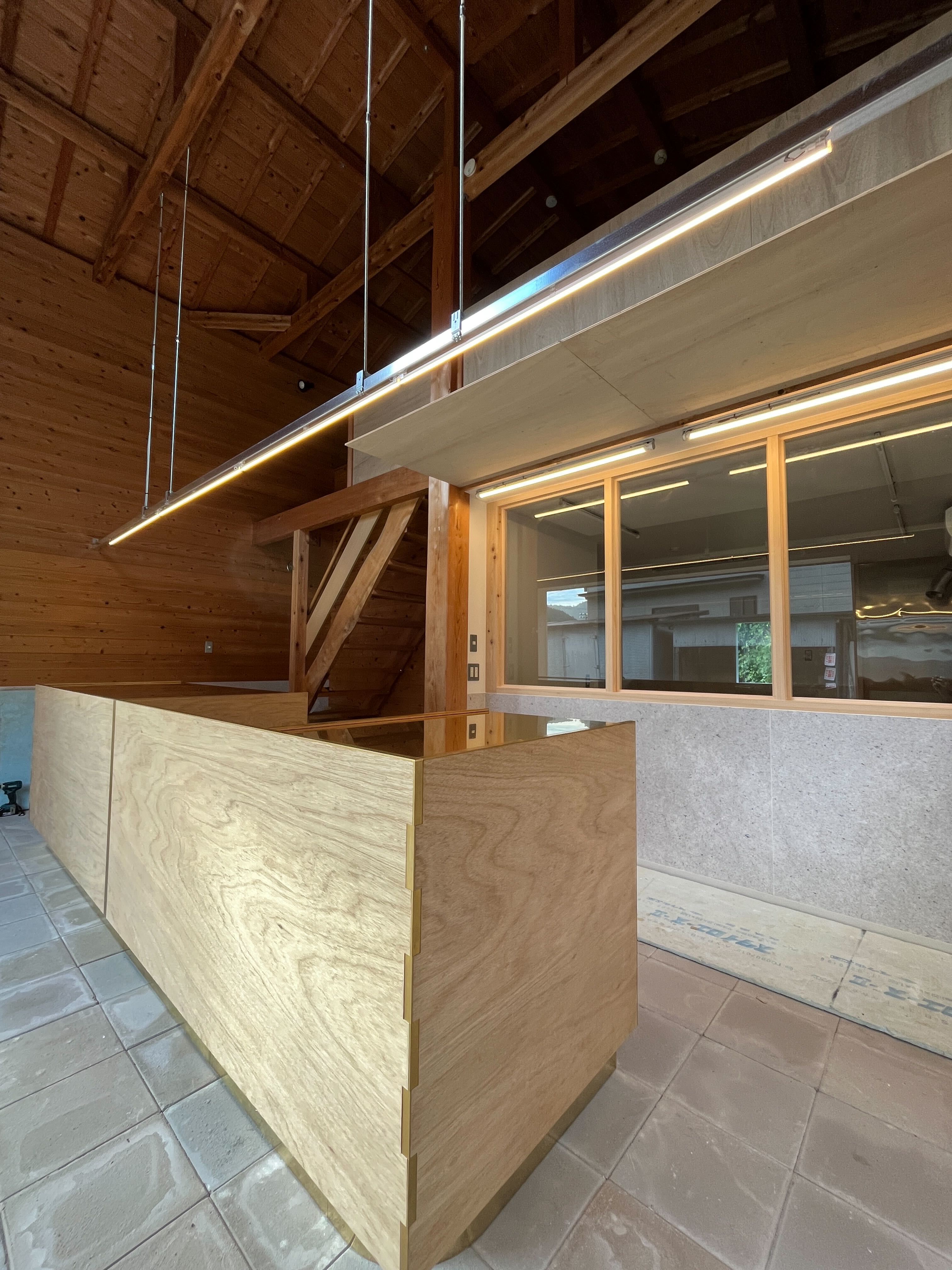
A large 3.6-meter-long counter was created and placed in front of the fully open window. In addition to its original role as a counter to greet visitors, the counter, together with the curtain placed behind it, becomes a symbolic presence of the restaurant.
Rawan plywood was used as the main structural material, and CNC machining was used to shorten the processing time by performing the necessary processing in advance for mortise and tenon machining and assembly. Also, by utilizing the high precision of CNC machining, we intended to leave beautiful details within the large surface by creating gaps between the side and front arare frames and inlaying the brass.
◯カウンター
全面に解放された窓ガラスの正面には長さ3,6mの大型カウンターを制作し配置しました。来客者と応対する本来のカウンターの役割に加え、後ろに配置される暖簾と合わせてお店の象徴のような存在となります。
素材にはラワン合板を主に構造材として使用し、CNC加工でほぞ加工や組み立てに必要な加工を事前にすることで加工時間の短縮を図っています。またCNC加工の精度の高さを利用し、側面と正面のあられ組みに隙間を作り真鍮をはめ込むことで、大きな面の中に美しいディテールが残ることを意図しました。

